Archives

Thursday, 22 December 2011

Typogateaux

I chose to create a typogateaux from a bought 'Manderin' cake that was then crafted into a typographical form. I also purchased a 'Brownie' kit, the mixture consisted of a powder that was mixed with 2 table spoons of oil and 2 table spoons of water. I was trying to focus on the visual aspect rather than the taste as the scoring was based on the inside characteristics (evenly baked, free from air pockets) & the outside characteristics (consistent shape/size/surface; overall appeal).

I used jam to provide a more rigid structure for the sculpted letters, I used to work in a restaurant which explains the A La Carte appearance.


Other entries


Tuesday, 13 December 2011

The 7 steps of research


This is an info-graphic representation of the seven steps to take when researching, designed by myself.


  • Identify the terms of reference1
  • Survey past work2
  • Find your approach3
  • Collect the data4
  • Analyse the data5
  • Discuss the findings6
  • Present the findings.7
The first 3 steps are linked because your establishing your approach, 4 and 5 are connected to the first 3 steps because you may have to re-visit these stages if your approach doesn't seem viable. 6 and 7 follow.


Thursday, 1 December 2011

Editing - Using Photoshop.

Original


Edit


The workshop involved creating adjustment layers for certain photographs, adding layers and altering levels. I did the edits below, Subtle differences worked better than totally altering the mood of the photo.

Original


Edit


Original


 Edit


Some notes taken from the session:


Automate = Photomerge = Panorama view....Load images, select 'create smart object', this then merges the images and gets rid of the moving factors in the image, select 'layer' - smart objects - stack mode (reveals the new image) to get things like clouds to stop merging and leaving blurs instead of crisp clouds. Put the original on top and then use the magic wand to delete the objects u don't need.

The photoshop upgrades aren't always the most useful, for e.g. when you need to create a contact sheet which the newest photoshop doesn't have set. Go on Apps, go on Cmdi, select 32bit...Automate - contact sheet.

If you change your setup to produce CYMK colour it will loose the true quality of the colour and the change will be unchangeable, so whenever your printing a photograph, make sure the colour is set too RGB, this ensures the print is top spec.

Type - resterize, select similar, new adjustment layer, then alter the hue and saturation, delete the original text, I'll be left with the outline, with this I could add an adjustment layer and change the effect.

Saving images to the internet - (the following format is related to the size used on the BBC's website)
Resolution: 72
Width: 500
Height: 503
Save the image as a web based format i.e. JPEG
File - Window - Actions = useful way of recording your actions on Facebook.
We then created a droplet which is a photoshop application, Automate creates this droplet.

Sunday, 27 November 2011

YR1 Essay Question - Initial Bibliography

Initially I was contemplating the first question...
Focussing on specific examples, describe the way that Modernist Art & Design was a response to the forces of modernity?
It seemed like the most logical approach as we'd explored the modernist movement in more depth than the other subject matters.
Using the Internet and Library as my referencing sources I choose 5 potential books to use...


1. NO MORE RULES - GRAPHIC DESIGN AND POST-MODERNISM - RICK POYNOR
LIBRARY CLASSIFICATION - 741.6
ISBN - 1856692299

2. GRAPHIC DESIGN - A NEW HISTORY - TEPHEN ESKILSON
GOOGLE BOOKS

3. 'THE BAUHAUS GROUP: SIX MASTERS OF MODERNISM' NEW YORK, RANDOM HOUSE - WEBER, NICHOLAS FOX 
LIBRARY CLASSIFICATION - 709.43

4. 'ARCHITECTURES: MODERNISM AND AFTER' OXFORD, BLACKWELL. BALLANTYNE, ANDREW.
LIBRARY CLASSIFICATION - 724.9

5. 'PIONEERS OF MODERN GRAPHIC DESIGN: A COMPLETE HISTROY. 'LONDON, MITCHELL BEAZLEY. AYNSLEY, JEREMY.
LIBRARY CLASSIFICATION - 741.605

Despite finding these sources, I'm still not 100% definite on the essay question I'll proceed with, although it would be a suitable question to choose, I think a more interesting topic would be; Could it be argued that fine art ought to be assigned more 'value' than graphic design? It has a strong subject matter behind it and would also make better reading in my opinion. Fine art is not an easily definable subject and to say that both are exclusive fields would be incorrect, they both spill into one another and are reflective parts of our society and culture.

Potential Sources (This list will be added too as there's more light shone on the subject matter)

J Storey, (2006) Cultural Theory and Popular Culture , (Pearson Education)
Matthew Arnold, (1960) Culture & Anarchy

Tuesday, 22 November 2011

Colour Theory, BASIC PRINCIPLES OF COLOUR

Type of Colour:

  • Additive = RGB COLOUR
  • Subtractive = CMYK COLOUR
The RGB color model is an additive color model in which redgreen, and blue light is added together in various ways to reproduce a broad array ofcolors. The name of the model comes from the initials of the three additive primary colors, red, green, and blue.


The CMYK color model (process color, four color) is a subtractive color model, used in color printing, and is also used to describe the printing process itself. CMYK refers to the four inks used in some color printing: cyanmagentayellow, and key (black).


RGB VS CMYK


On-screen colour is RGB and print is CMYK. In effect, the two are opposites since again, one is subtractive colour and the other is additive colour. When you manipulate and create images in the digital environment, it’s all RGB—although programs like Adobe Photoshop allow you to convert to CMYK and effectively simulate the CMYK colour space on-screen.

Monday, 21 November 2011

Colour Theory CONTRAST

During this exercise we visualised how colours appear slightly different when they're placed next to different colours, the reason for this is the way we perceive different contrasts. Our eyes are drawn to contrast. We can’t help it. In any design our eyes will immediately go to the area of highest contrast.

Contrast of tone.
This is the contrast between light and dark. This is most obvious in black and white compositions, but is equally applicable in color. This is the most powerful form of contrast. In any composition we are drawn to the place with the greatest tonal contrast.


Contrast of hue
This means colour, the farther apart two colours are on the colour wheel, the greater their contrast of hue, so blue and yellow have a greater contrast than blue and purple.


Contrast of Saturation
This contrasts bright, rich colours against faded, muddy or pastel colours. Placing them next to each other will make the rich colours seem richer and the faded colours seem more faded.


Contrast of extension
The contrast of extension refers to the quantity of colors used in a visual display. It depends on basically how much of one colour there is in comparison to another colour. A darker colour is generally heavier than a lighter colour

Contrast of temperature
The contrast of temperature refers to the way we associate certain colours with temperature e.g. Orange and Red are generally associated with warmness, in opposition if something is blue we tend to associate this with coldness. These temperatures also depend on what they're placed next too.

Complimentary Contrast
When some colours are placed next to each other they battle with one another, this often makes the image slightly fuzz as your eyes take in the difficult observation.

Examples of the practical Investigation...


Contrast of Hue- Juxtaposition of Colours


COLOUR...
(Secondary research)

Additive Colour
An additive colour model involves light emitted directly from a source or illuminant of some sort. The additive reproduction process usually uses red, green and blue light to produce the other colours. Combining one of these additive primary colors with another in equal amounts produces the additive secondary colors cyan, magenta, and yellow. Combining all three primary lights (colors) in equal intensities produces white.
Additive color systems start without light (black). Light sources of various wavelengths combine to make a colour. In either type of system, three primary colors are combined to stimulate humans’ trichromatic color vision, sensed by the three types of cone cells in the eye, giving an apparently full range.


Subtractive Colour
A subtractive color model explains the mixing of paints, dyes, inks, and natural colorants to create a full range of colors, each caused by subtracting (that is, absorbing) some wavelengths of light and reflecting the others. The color that a surface displays depends on which colors of the electromagnetic spectrum are reflected by it and therefore made visible.

Subtractive color systems start with light, presumably white light. Colored inks, paints, or filters between the viewer and the light source or reflective surface subtract wavelengths from the light, giving it color. If the incident light is other than white, our visual mechanisms are able to compensate well, but not perfectly, often giving a flawed impression of the "true" color of the surface.


Primary Colours
This definition really depends on what type of medium of color we are using. The colors that are seen when sunlight is split by a prism are sometimes called the spectral colors. These are red, orange, yellow, green, blue, indigo, and violet. These ROYGBIV colors are often reduced to three "red, green, and blue-violet" which are the primary colors for the additive color system (light). The primary colors for the subtractive color system (paint/pigment) are "cyan, magenta and yellow." Notice that "red, yellow and blue" should never be used as the combination for color primaries!

Secondary Colours
Secondary colours result from the mixing of two of the primary colours. Red (magenta) and yellow produce orange, yellow and blue (cyan) produce green while red and blue (cyan) produce violet. For example, if you add more red than yellow, you get a reddish orange, and if you add more yellow than red, you get a yellowish orange.

Tertiary Colours
Tertiary colours are browns and grays, containing all three primary colours. They're created by mixing either all three primary colours or a primary and secondary colour (secondary colours of course being made from two primaries). By varying the proportions of each primary colour, you create the different tertiary colours.

Complimentary Colours
Colours that are opposite one another in the chromatic circle are called complementary. For example, green (resulting from the mixing the primary colours yellow and blue [cyan]) is complementary to red. Orange (a mixture of yellow and red [magenta]) is complementary to blue, while violet (a mixture of blue [cyan] and red [magenta] is complementary to yellow.

Chromatic Value
When we describe a color as "light" or "dark", we are discussing its chromaticvalue or "brightness". This property of color tells us how light or dark a color is based on how close it is to white. For instance, canary yellow would be considered lighter than navy blue which in turn is lighter than black. Therefore, the value of canary yellow is higher than navy blue and black.

Hue
This is what we usually mean when we ask "what colour is that?" The property of colour that we are actually asking about is "hue". For example, when we talk about colours that are red, yellow, green, and blue, we are talking about hue. Different hues are caused by different wavelengths of light.

Chroma
Think about a colour's "purity" when describing its "chromaticity" or "CHROMA". This property of colour tells us how pure a hue is. That means there is no white, black, or gray present in a colour that has high chroma. These colours will appear very vivid and well, ... pure. This concept is related to and often confused with saturation.

Saturation
Related to chromatic value, saturation tells us how a colour looks under certain lighting conditions. For instance, a room painted a solid colour will appear different at night than in daylight. Over the course of the day, although the colour is the same, the saturation changes. This property of colour can also be called intensity. Be careful not to think about SATURATION in terms of light and dark but rather in terms of pale or weak and pure or strong.

Tints, Tones and Shades
These terms are often used inappropriately but they describe fairly simple color concepts. The important thing to remember is how the color varies from its original hue. If white is added to a color, the lighter version is called a "tint". If the color is made darker by adding black, the result is called a "shade". And if gray is added, each gradation gives you a different "tone."


www.colorcube.com
www.paintcafe.com
www.pantone.co.uk


A few pictures from visual investigation during our Colour theory lessons


Colour Theory - Pantone...

We discussed; colour theory, colour wheels, primary colour, tertiary, hue & saturation etc...
Everyone had collected 5tones of colours, consisting of; red, green, blue, orange, yellow and violet.

After arranging the colours into groups, our aim became to merge the colours, creating a colour wheel. This meant; yellows blended with greens, greens blended with blue etc...this really got us thinking in terms of how we compare and differentiate colours. 


We were then given access to a Pantone colour guide..."The Pantone Colour Matching System is largely a standardized colour reproduction system. By standardizing the colors, different manufacturers in different locations can all refer to the Pantone system to make sure colours match without direct contact with one anotherwikipedia.org/wiki/Pantone


In groups of 4/5 people, We chose a central colour and subcategorised 3 other purple items in order, using TINT, HUE and SHADE.

Using a PANTONE colour guide we where able to match each colour and give the colour their own COLOUR CODE. The results were as follows...

PRIMARY
DE188-3C

HUE                           

DE224-7C
DE223-8C
DE200-4C


SHADE
DE190-1C
DE188-1C
DE1951C


TINT
DE176-9C
DE152 - 9C
DE152 - 5C


As a way of becoming more familiar with Pantone, we were asked to identify our Favourite colours. After all...Your not a Graphic Designer until you have a favourite Pantone Colour.

You can find these colours on the following website...www.pantone.co.uk and in an earlier post.
  • Orange = 16-1359 TCX ORANGE PEEL
  • Violet = 17-2624 TCX ROSE VIOLET
  • Yellow = 14-0837 TCX MISTED YELLOW
  • Blue =  19-4057 TPX TRUE BLUE
  • Red = 18-1664 TPX FIERY RED
  • Green = 16-6339 TPX VIBRANT GREEN
Using Paper and certain objects, I looked at contrasts in Hue, Tone, Saturation, extension and temperature.

Simultaneous contrast :
Merging of colors - High chromatic against low.


Thursday, 27 October 2011

Anatomy of type - Hierarchy of Type

As a starting point we began looking at the anatomy of type, the hierarchy, layout and the composition


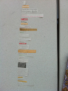
Our aim was to find out how many different typefaces in different sizes and styles there were in different newspapers, consisting of the; Metro, Guardian, Independent and Daily Mirror. The results were as follows:

THE METRO: 28
THE GUARDIAN: 43
THE INDEPENDENT: 31
THE DAILY MIRROR: 42

As the next stage of investigation, we dissected a chosen page from each newspaper, picking out all the differences and arranging them in POINT SIZE..


 THE DAILY MIRROR


 THE GUARDIAN


 THE INDEPENDANT


THE METRO

As I develop my understanding of type hierarchies, I should be left with 9 hierarchies in the form of; 3magazines, 3 newspapers and 3posters. I will also be carrying out independent studies into type as ongoing investigation.

Friday, 23 September 2011

The first Group Collaboration.

We didn't want students reading the leaflet, being interested for 2 minutes and then discarding all the information, therefore we thought of an idea that should make students keep the card. This was to put all the local taxi numbers on the back, saving the students the effort of collecting all the local taxi cards, or saving them all singularly.


In order to make the information accessible and easy to carry around. We decided to place the diagram within a little card pouch that would fold up to fit in your wallet. The photographs below demonstrate this....


About Me

My photo
Leeds College of Art. Graphic Design.
 

Copyright 2010. All rights reserved.