Archives

Thursday 26 January 2012

Useful Questions

Evaluation
  • What is the problem? 
  • What subject/area of study are you focusing on? 
  • To what depth are you investigating this area/subject? Is this sufficient? 
  • What is the form and amount of your research to date? 
  • What visual material do you have to work with? 
  • Is there an appropriate amount of work for the time you have had to develop it? 
  • If there isn't why is this? How could you improve your work-rate? 
  • What is achievable in the time available? 
  • What methods are you using to evaluate the progress of your ideas? 
Focus
  • What are you identifying as areas worth developing further? 
  • What are you trying to communicate? 
  • What audience have you identified? 
  • What problem(s) have you identified? 
  • How do you intend to solve (these)? 
  • What further research does this require? (what, where, who and when?) 
  • What is your intention? 
  • Have you moved on from your initial starting point. If so how and why? What methods are you using to document this development?
  • What processes will you need to use to develop your work? 
  • Do these processes require workshop access?

Monday 23 January 2012

Design Principles// Type & Grid

Kerning - The spacing between letters.
Tracking - The spacing of a whole line / Paragraph spacing.
Type is made up of many components, including; Weight, Size & Style.
The term Leading refers to the spacing between lines.
'Font' refers to a digital typeface, whereas a typeface refers to the whole range of type as oppose to a font.

Method
  • Measuring the Ascender to the Descender gives you the PT size
  • To work out the leading, measure baseline to baseline and then subtract PT size.
  • The ascenders are generally slightly higher than capital letters.
  • PICA relates to the length of the sentence. 
  • the grid should be reflected through the whole magazine (template)
  • The more columns there are, allows more scope to edit
After learning this information we then measured up some grids on newspapers, finding out their point size, leading and order of Hierarchy. Our task for next week was to collect a newspaper and develop a grid, along with an existing magazine that will be used as a thumbnail layout in the next session.


20-14=6leading


Potential thumbnail layout


The more columns there are, the more scope to edit and transform your layout/s.

Sunday 15 January 2012

Indesign Workshop


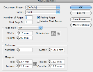
  • Use the Column, Margins, Bleed and Slug for guides.
  • Gutter = Space between columns
  • Bleed = Space around document to give a margin of error (useful when trimming etc) Standard bleed is usually 3mm
  • The Slug margin is larger than the bleed because it's commonly used for printer registration marks or colour swatches etc.
  • Facing pages = pages laid out next to each other in a spread (Usually for a book)


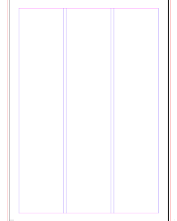
Black lines - Edge of Page 
Blue lines - Column Margin 
Red lines - Bleed Guide


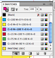
Creating a box and applying colour with the colour swatch palette.

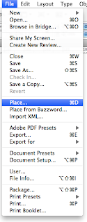
When bringing images into Indesign you'll most likely be using Photoshop, the normal resolutions usually 300DPI, Save the image as Actual size and either as a PSD document or TIF file. CMYK (Printable colours) or greyscale.

When using Illustrator, CMYK or Greyscale, save as AI file type.

It's more efficient if you keep all the imported images in one folder. Because INDESIGN will need to locate these images when you come to print.

By pressing 'W' the guides are lifted, giving you a print preview.


The images may appear in low resolution because they're pixel previews, this allows you to arrange the text and image more efficiently, When printing the final document, Indesign will find the actual image, and provide smooth vectors, like when you work within Illustrator.


In order to view images at the correct resolution select...
View // Display Performance // High Quality Display

Window // Text Wrap
Adjust values to add space around the image and to separate from the text.


Session 2
Appropriate to save as a PSD: When you're opening the document up at a later date, & intending to work on different layers. 
Parts of a layer can be transparent whereas some could be opaque. (Background layers that are locked do not support transparency.) You need to double click and unlock the layer for further development. 
Checkboard represents TRANSPARENCY.

Appropriate to save as a TIFF: When your designing for print or something commercially useable, do not save a TIFF file with layers (This is a new feature to the file type, therefore other software might not support the new addition.) 

Contour options: Using 'Alpha Channel' this means to use the transparent sections of the image, this defines what is opaque and what is transparent. Aligning text around the border of the image, this can be adjusted for example; the spacing of text from the image, this is often used to increase the readability of a document.

We were given the task of reproducing a magazine layout...


Text frame options, It's possible to take one text frame and make it into multiple columns. 
The text frames are all similar to Vector shapes in Illustrator. Instead of using a rectangular text frame, you can select the 'Direct Selection Tool' to alter anchor points and create a new shape.

You can directly manipulate images through In-Design, using the Effects Palette >> Select the drop down menu displaying the blend modes >> If you select the image and then choose 'Multiply', it will make the background Transparent. This means you avoid opening up Photoshop etc. 'Screen' will do the opposite, depleting all of the black as oppose to white.

Wednesday 4 January 2012

The Internet

Due to the popularity of the internet and peoples inhibitions to become recognised (Due to the mass media surrounding celebrities and their desirable lifestyles) average people have performed abnormal activities in hope that they become recognised...


'Chocolate Rain' Featured in LA Times, CNN, People Magazine & G4TV. Created new video for DR PEPPER.


Will it blend? Has his own branded merchandise, Appeared on the tonight show with Jay Lenno.


Shoes! Appeared on 8simple rules, Alias and Gilmore Girls.


Andy Mckee, Signed by CandyRat Records, Currently on a world tour promoting his music.

Popular Culture & Surrealism

Nelson De La Nuez,  his work is a unique juxtaposition of pop and surrealism of rich culture .

He has the right combination of social and cultural relevance in the artwork mixed with emotional ties, all of which have brought him to the forefront of the art world.  The galleries, museums and prestigious art collectors have embraced his work, including throughout the U.S., Europe, Alaska, Canada and Australia. De La Nuez’s artwork is collected by many well known celebrities and has been featured on countless television shows, including, to name a few:  VH1: Fabulous Life of: “The Latest in Billionaire Home Décor,” “Celebrity Apprentice,” “Inside Edition,” MTV “Cribs,” HGTV “Designer’s Challenge,” E! “Celebrity Favorites” and “TMZ: Michael Jackson’s Final Art Purchase.” Pop Land Publishing has just published his book, “Pop Americana: the Pop Art of Nelson De La Nuez” and his art is hanging in some of the most prestigious art collections in the country.  He is the official 70th Anniversary artist for the Wizard of Oz film and has created original artwork for the iconic movie, one of which, “Ditching Dorothy,” is forever immortalized on a limited edition sheet of US postage stamps.


About Me

My photo
Leeds College of Art. Graphic Design.
 

Copyright 2010. All rights reserved.