Archives

Friday 31 May 2013

What is good? Solidified Design direction

The ball was rolling, I was on my way to completing the identity for the exhibition and it was time to start experimenting with materials and concepts.

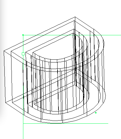
For the resource box, I was yet to find something suitable to resemble actual honeycomb so I began on the other aspects, including the perspex. This would act as the bottom of the box for the publications etc, once the viewer would of taken all this out, they'd be surprised by a replication of a honeybee hive, made visible by this layer of clear perspex. 

Instead of keeping this completely free of design, I wanted to initially use it as a canvas for a typographic poster, using reflective vinyl. In my imagination it looked quite striking with the replicated hive behind. However, along the way I ran into various issues, I found out that when using the vinyl cutter its advised to use Sans serif fonts with a block characteristic rather than thin serif typefaces such as Garamond. The aftermath can be seen below...


In the actual 'hive' itself, I wanted to use various types of honey to give it a more realistic and weathered look as oppose to a plastic / cheap appearance. You can see in the image below, that honey eventually becomes a solid mass, with this in mind, I had the idea to string the honey over each hexagonal shape hopefully giving it varying depths...


After laser cutting the side panels of my resource box, I decided to varnish the exterior. After this I knew It would make it easier to weather the box, giving it that traditional appearance which would work in synergy with my tone of voice within the exhibition.


Inside the hive, I wanted to use laser cut bee's which would decorate the surface of the honey / honeycomb, hopefully adding to the sense of realism, however due to the lack of planning on this aspect, the outcomes were quite shoddy. During the laser cut process, every single leg had been melted off due to their small / thin size.


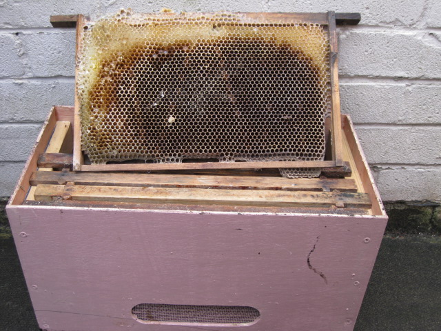
Without the honeybee's, the hive would be incomplete. In order to regain the qualities of the resource box, I tried to think of anything that would look better than real honeybee's...and couldn't think of anything that would add such a striking effect when noticed, therefore I set myself the task of gathering some dead honeybee's from a park nearby. Due to the time of season it was very easy to find honeybee's, a large proportion of worker bee's were out pollinating (as you can see below).


Experimenting with embossing / debossing. (Letterhead design)


Although the effect looked quite attractive, up close the wooden pieces were splintering and disrupting the overall piece of paper, leaving marks and blemishes. Due to the time constraints I couldn't develop this approach any further, in hindsight I wish I'd used perspex and not applied as much pressure.

Friday 24 May 2013

What is good? Initial Design Ideas

After my collation of research both primary and secondary, it was time to start developing a design direction, it came to my attention that I'd need to start getting the ball rolling on the production side of things if I was going to complete my deliverables in time. I'd solidified the fact that I was going to present all of my deliverables in a resource box that would be available to buy at the exhibition or online as a sort of beginners pack (this would be promoted through outdoor promotions)

Therefore I began on designing my resource box, planning the dimensions and unique aspects of it to hand over to woodwork, who would cut the sections of wood ready for myself to piece together and develop. 

I didn't want it to be JUST a box, I needed a USP that would make the box desirable. With the help of my research I knew that the hive was a unique exhibit that showcased the honeybee's lifestyle, so was there anyway I could incorporate this?

The image below shows my initial design ideas, as well as the development of my chosen design across different aspects of the exhibition including bus stops etc. & the planning of my resource box.


Making my direction crystal clear...


Digital experimentation... 

After developing the following design, it kind of opened my eyes up to the fact that I needed to keep my tone of voice quite serious and educational rather than comical (which the design below was suggestive of) therefore I altered my approach and went on to design something that I thought suited my tone of voice.


Colour alterations...


The great thing about the concept behind my logo, was that it could be used across a multitude of items, I had a great idea of using it on the back of staff uniforms with the concept; If you have any queries or questions, look out for the 'B's buzzing about.

The logo can also be applied to different areas of the exhibition for example; 'b' informed, 'b' social, 'b' healthy'.

Seeing the same logo plastered everywhere could become quite tedious so I've began to explore different approaches, adding a title to the logo and also generating a secondary logo to be used on the publications and promotional materials


For the exhibition to have a sense of realism, I needed a venue and it seemed the Natural History Museum was a plausible example, it has a past record of exhibiting such insects and holds exhibitions quite regularly. For each different event they host, they incorporate a design into their logo, I tried this approach with unsuccessful results... the connection wasn't strong enough for me and I felt it worked best when it was in its simplest (white & black) form.


Type experimentation - Sans serif typefaces just didn't communicate what I was aiming for, they were more suited for the top design which was a lot more casual and less serious. On the other hand Serif typefaces communicated a sense of seriousness and gave the identity a more refined look.


I've tried to incorporate the movement of a bee through the positioning of the text. 

You'll notice the 'P' has been slightly manipulated to suggest that it could also be an 'F', attaching two meanings to the title.

Tuesday 21 May 2013

What is good? Review of Research 2

After my visit to the museum, I felt I gained a valuable insight into how exhibitions work as an event, how people co-ordinate themselves around that event and how the theme of the event is visible almost everywhere.

Following on from this I decided to try and gain as much primary research as I could, I'd already gathered numerous articles and information from the internet but decided for my exhibition to gain some unique information, I needed to turn to other sources of information and keep my access to the internet restricted. 

I visited a bee-keeper that lived nearby, after telling him my reasons to find out information he was more than happy to help, providing me with literature, primary sources of honeycomb, and letting me study inside an unused bee-hive. Without this experience I really doubt I'd of been able to assemble a suitable replication of a beehive.


As part of the publications for the resource box I'd be developing, I thought it would be a very useful and appropriate idea to include contact numbers that could help people set up hives in their local communities. Including such an element into my exhibition gave way to an online presence and another reason for people to attend the exhibition. Not only would I highlight the importance of the honeybee and their decline, I'd also provide a solution for viewers, giving them the necessary tools to combat their decline.


Visit to the Mirehouse, Historic House & Gardens in the Lake District. Here they displayed a bee garden which you could view, although this visit didn't really provide me with any information I didn't already know, it gave me the opportunity to build up my primary photographs which would eventually be compiled into my exhibition.


During a visit to Somerset, I came across a National Trust shop which sold various books on honeybee's and the reasons for becoming a beekeeper, I jotted down some notes and took a few photographs of the most important pages. What all this primary research proved...was that the Honeybee was an issue some people really cared about and understood. A point I really needed to convey in my exhibition, that there's a reason others should care as well. 


While in France, I came across a shop that specialised in the uses of honey, developing honey into an array of products, ranging from soap and facial cleaners to Alcohol and medicinal options.


About Me

My photo
Leeds College of Art. Graphic Design.
 

Copyright 2010. All rights reserved.