Archives

Wednesday 30 January 2013

ISTD / Web design development / Social Prescence

Creating a social hype / 

Due to the nature of the business and the nature of society, everyone usually finds the web presence there first point of investigation when it comes to find out information about something unknown.

Twitter is one of the biggest social networking sites that people use to predominately follow icons...As a building of contacts I began following, butchers, locally sourced etc...


I wanted the theme of contemporary and traditional carried through to my twitter page, using the wooden header brought the logo out and the orange was clearly visible when viewed as a smaller image. As you scroll down the twitter page, which would be filled with weekly deals, you'd constantly see the mutton quad logo and cutlery set on the left hand side...as you can see in the second screenshot below.


Web development...

Developing the background/ Introductory page to my website - I decided against using just the main logo on its own, because without the cutlery it didn't really have enough significance of a restaurant but I really feel the knife and fork emphasise the shape of the badge, which now looks like it bares some resemblance to a dinner plate.


Applying the full bleed background image...


Coding...


Favicon...


Design development / Web development...


Tuesday 29 January 2013

ISTD / Web development...

Due to the time constraints and theoretical side of the brief, I thought it would of been a better idea to develop a website that best represented the attitude of my identity, I decided to find a zip file that would give me the basic layout to my website, I then edited and re-designed the website for my approach, this also helped me understand java/ jquery in a lot more depth...


Site Index. Jquery / Flexslider - Showing different examples of the food Mutton Quad produces.

Wire Frame. Jquery / smooth scroll


OUGD 504 Evaluation.

OUGD 504 Evaluation

1. What skills have you developed through this module and how effectively do you think you have applied them: 


Throughout this module I've tried to be more ambitious with my outcomes as oppose to sticking with 2D format, broadening my methods of design production has certainly encouraged my creativity, although everything didn't go as smoothly as I'd wished (such as embossing) it was important to keep myself experimenting and learning new things! At the beginning of the year I was keen to use the laser cutter until it became a habit, I wouldn't say I relied on it at all but I'd always be thinking 'Would it look better engraved'. I've managed to move away from this and try my hand at various print processes throughout this module. In terms of skills, the most obvious would be designing for web, creating a website that was functional and efficient. I started very basic and began introducing more complex aspects of coding, such as the 'lightbox', the more I organised and developed my coding, the more confident I was to experiment, introducing aspects such as favicons. But the most important skill I'd picked up from web design, was preparation. Developing wire frames and site index's really helped the navigation of my websites become effective. During this module I've allowed myself to let the design process influence and inform my designing, this was something I'd struggled with in the first year because I'd never really let the conceptual or design process influence my design idea, I'd rigidly stuck to a design until I was happy with the outcome. Moving away from this trait has helped me answer the brief more specifically, digest peer feedback and target my audience more effectively.

2. What approaches to methods methods of design production have you developed and how have they informed your design development process 

In terms of print processes I'd say my strongest development was experimenting with new procedures, I learnt more from my mistakes than I did when procedures went smoothly, for e.g; I'd never used gold foiling before and thought I'd introduce myself to it using the quicker method (due to time constraints) of applying heat to foiling, the heat of the laminator binds the foil to the black ink, but because of my unfamiliarity with this process, myself and a few other peers used the foiling on the wrong side and realised it had produced a very varnished effect...similar to spot varnish, a useful concept for future reference! I also tried my hand at embossing and feel much more confident to produce successful results in the future. At first, new methods of design production are always daunting but once I've completed the procedures I always feel like I can return and even combine different methods of production to better my work.

3. What strengths can you identify in your work and how have/will you capitalise on these?


My ability of coding has definitely become a strength through this module, I managed to do a lot of research into Java and apply different elements into my coding that wouldn't of been possible if I hadn't exhausted my investigation into web. I've identified different print processes and began to move up the creative ladder in terms of producing clearer and more understandable design boards. I've exhausted a range of products for 504 and also learnt a lot from 'Design for Print', taking the information and applying it in context has improved the way I put together my work, taking into consideration stocks and binding methods.

4. What weaknesses can you identify in your work and how will you address these in the future


I haven't exhausted all of my options, I could've experimented more with different stocks, different design processes and different concepts! Better preparation for crits needs to be put into action so I can receive more effective feedback!

5. Identify five things that you will do differently next time and what do you expect to gain from doing these?


1. More idea generation/ design sheets - generating a clearer concept.
2. Continuously write TO DO lists! - organise my time more effectively
3. Book print slots early on in the briefs - eliminating the need for drop ins
4. Prepare for crits/ clearer design boards - better and more focused feedback
5. Start completing mid-evaluations - gaining a better understanding of my progress.


How would you grade yourself in the following areas (5 - excellent to 1 - poor):
  • Attendance: 4
  • Punctuality: 5
  • Motivation: 4
  • Commitment: 4
  • Quantity of work: 3/4
  • Quality of work: 4
  • Commitment to the group: 3


Monday 28 January 2013

Design For Print - Design Development

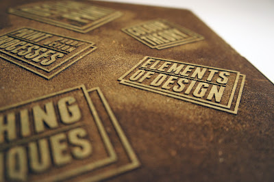
For the inside of my box I decided to develop the inside wrapper I'd previously designed, I'd realised using different colours just brought too many colours into the equation and would've taken a lot of emphasis away from the booklets once you'd seen it. Using the white paper samples Fedrigoni sent I decided I should experiment with different print methods and thought embossing would've really suited the subtle approach I'd been aiming for...


Instead of selecting cut through on the laser cutting machine, I decided to try a different approach and cut the negative, rasterizing the image kept everything together in the position I wanted however the final result wasn't very impressive, I'd used MDF wood and soon after it cutting out I went to emboss which meant the glue between the layers of mdf was still vaguely sticky, which made the whole process quite messy. I feel much more confident in using embossing now and think I'll use this process again and have much more successful results!


Final Booklets, x4 // Elements of design, Colour theory, Print processes, Finishing techniques...


Elements of design...


Finishing techniques / Binding methods


Print processes...


Colour theory / Colour management

Thursday 24 January 2013

ISTD / Visualising the identity in context

Traditional / Contemporary...

Due to the target audience and style of my restaurants identity I've tried to keep the use of wood consistent, also using an interior that adopts the same colours as my branding.

Chairs / Black
Light shades / Light grey


I've tried to permeate the branding throughout the whole kitchen, decorating the Light shades with the structural pattern I'd developed and making the key colour of this advertisement/ Kitchen design, yellow, seen most predominately in my identity. However I'm not really satisfied with the outcome because it doesn't permeate enough about the brand and traditional contemporary feelings, it feels too direct of a photograph.


ISTD / Aspects of the brand identity

Promotional leaflet


Business cards


Promotional items


If you have any of your meals left over at the end and wish to take them, the staff would wrap your meals up like so and brand the packaging.


Credit card receipts, customer copy


Letterhead


Sample/ Gold foil


The sample was much more successful when it came to the print aspect of the foiling, on the thicker stock below it didn't really take to it and left a worn look, the print also misaligned in the printer because it was a thicker stock and took a split second more to actually take the paper in, this was the reason for me printing more of the logo, the misaligned print couldn't of been used as a final because it was overlapping the background design, therefore I printed a straight line of them as an alternative which has worked pretty well considering it was a saviour for the GF smith paper.


About Me

My photo
Leeds College of Art. Graphic Design.
 

Copyright 2010. All rights reserved.