
*Altering your preference to Scratch disks in Illustrator CS6 means that photoshop files can be transferred into Illustrator. // Optimising Illustrator. For you changes to take effect you'll need to close & re-open the application.
SUMMARY: Working with colour & understanding print, taking into account; COLOUR, SWATCHES, SPOT COLOURS, PANTONE REFERENCES AND TINTS.
In todays session the main focus is on how to set up your document ready for print, using the most effective and efficient methods.
Changing your backdrop - Illustrator> Preferences> User Interface
CMYK (Cyan, Magenta, Yellow, Black) colours are referred to in the industry as PROCESS colours used for print, as oppose to RGB which is primarily used for web based material and animation.
CMYK is subtractive, meaning RGB is additive. CMYK works with an absence of colour with transparent inks, meaning its designed to create and combine colours...the inks aren't opaque.
1))))) When you've selected the 'Swatch' option on the right hand side of Illustrator, select the drop down menu and click 'Show all unused'. By removing these swatches from your palette, your free to create your own personal Swatch. When selecting your palette, make sure your working in 'CYAN, MAGENTA, YELLOW & BLACK' .


This is what your colour palette will look like once you've got rid of all the unused swatches

**Setting up Swatches... Use the swatch menu to navigate to a 'small list view' - this makes it easier to see what your working with, providing you with the values and colour names. It also signifies if your working with a spot colour or a global swatch.

The registration marks are pretty beneficial because they print crop marks, a very useful tool when printing large quantities.
In illustrator we have the option to work with Global or Non- Global colours.
Selecting Global means that any shape thats had the applied swatch will receive an update (Linked). Using this process will make it easier to adjust your colour palette and incorporate colour harmonies etc.

Select a Global colour on your personalised swatch then go to your colour palette, alter the percentage of your Solid colour & then add a new swatch. This results in a tint of the original colour as you can from the screenshot below.


Spot colours: A colour that prints solely, and not as a component of CMYK, but as a ready mixed ink. Primarily used for consistency and in the commercial printing business, using one colour is less expensive. Using one printing plate is obviously cheaper than using four.
e.g. Heinz baked beans - Adopts spot colour consistency. The company will refer to a unique number swatch.

Colour books - Stock that the ink is going to be applied to. This option will open a large range of pantone colour swatches.
(Pantone reference - predominately used in the UK.)

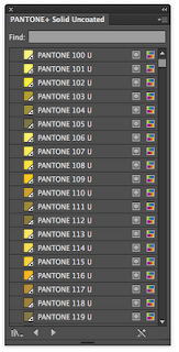

Library menu >small list - this allows you to see the names and references of the PANTONE colour.
NEVER CHANGE THE NAME OF THE UNIQUE CODE, this will result in the printer being unable to find your specific colour. This is because these colours offer a more flexible choice of unique colours that you cannot get when mixing CMYK.
*You can tell a spot pantone colour because it will have a little white triangle with a spot in the middle, as you can see from the screenshot above!
You can also create TINTS for the spot colour using the colour palette options.
Saving the swatch as 'Adobe Swatch Exchange', will make the file become available across different software such as: Indesign and Photoshop.

No comments:
Post a Comment