

For a quick turnaround, I decided to enter the 'Purple leaves' competition, this was because the guidelines were so broad. This meant I'd be able to use some of my free time to create a detailed illustration that would hopefully be detailed enough to be scanned in and used, If I'd of had more time and less constraints in terms of everything else I've got to produce I would of used illustrator to draw around the design. A swell as finding this competition, I managed to come across another similar competition which I'd found through communicating with my peers, it was a t-shirt competition based around the sole concept of 'monsters'! I thought this would've been a great competition to enter seen as my illustration was a monster anyway!


The illustration below was created with the concept of 'Knucklehead' in mind, Over summer I had the time to add depth to what seemed like an original approach...using the idea of a knuckleduster and the phrase 'Knucklehead'...

http://www.urbandictionary.com/define.php?term=knucklehead
The concept/ Create the face of a character that could be applied to a t-shirt/ jumper. Embrace the idea of a knucklehead and try to portray a stubborn, hardened facial that also emulated the character of a monster...
The original drawing...
Knucklehead


Initial Edits/ Although the initial design was for a t-shirt, I began editing the scanned illustration on 'Photoshop', cropping certain areas gave me the scope to create a completely different deliverable, using aspects from my first year (including the brain & eye illustrations) I was able to create two posters that would link together. With the visual below, you can imagine how the posters would look, if there were numerous copies...a continuous flow of faces. Undertaking this approach also made it a viable option when it came to imaging the design in different contexts such as on walls. I used this insight for the deliverable of the other competition, where it as possible to apply my design to bags, walls, etc...

Development...


Because of the designs detail, I didn't want to jeopardise the quality of its aesthetics by bringing in colours, this would mean I'd have to delete every single aspect of white from the inner parts using the magic wand tool.


From a personal POV, I was more happy with the smaller design placed in the top-right corner of the white t-shirt below. This was mainly because the illustration in the centre of the tee looked quite cliche, not in the sense of design. But in the sense that almost every t-shirt that features a character is placed directly in the middle of the t-shirt at a similar size.
The smaller design looked more suitable for a male target audience of 16-30 year olds. And still worked visually, from this distance you could still see the shape of the knucklehead.

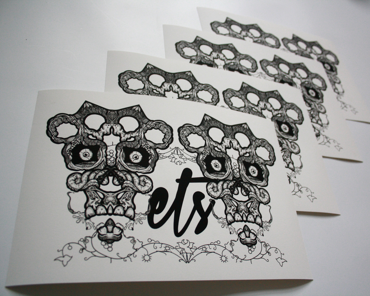
Further exploration/ Could be used as a promotional leaflet for the t-shirt upon release. Obviously I'd change what the text says but it gives you an idea of the style of text that would best suit the appearance of my illustration...

Displaying how the design would look on material as oppose to graphic representations.


Further exploitation.
Communicating with my peers also led me to a more suited design competition that was also judging t-shirt designs, but based around the sole concept of 'monsters'! I thought this would've been a great competition to enter seen as my illustration was a monster anyway!
Submitted boards...


I'll be printing these t-shirts in due course purely for the principle of screen printing, I need to make sure I've got a firm understanding of the technique and process before I reach 3rd year.

Using a fabric screen at LCA was a new process for myself and I was quite wary of how much detail one of these screens could take. The holes between each strand of fibre were larger due to the more course nature of the inks. Despite this the exposure unit had seemed to pick up all of the detail! It was an overall success! The first print came out perfect, as you can see on the white material in my folder. Despite a growth in confidence the second print just didn't seem to come out as good, the whole of the design had printed, but there had been a slight fade nearing the top of the knuckle. However it has once again been a learning curve, I didn't need to screen print my designs onto an actual t-shirt but it let myself know that it could be a successful design, I've worn the t-shirt and people have commented upon it, thinking I'd bought it.


No comments:
Post a Comment