Throughout the development of my work I've tried to consistently introduce the theme of type, focusing on the structure and format of the type and also examining the idea of 'Justified' & 'Kerning' (Uniformity).
Deliverables for the identity of the restaurant.
Identity includes...
- Promotional Leaflet
- Business card
- Exterior chalkboard
- Receipt
- Table number holder
- Toilet door
- Bottle design
- Interior bar design & wall display
- Order form
- Drinks mat
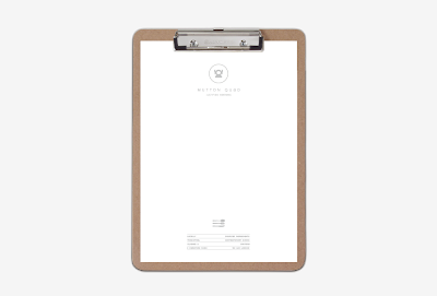
- Letterhead
- Menu Front cover
- Menu concept
- Uniform
- Exterior header signage
- Mock up of exterior
Drinks Mat
Instead of using a typical circular drinks mat, I wanted to use the decorative logo which means when a drinks placed on the mat, the logo and subtitle are still visible
Glass decorations - After some different layouts and designs I decided to use the following because when there placed next to one another they form a straight line, making the bottles look more unified when placed next to each other relating to the theme of Kerning.
Using the development below, created by combining the M & the Q, I created a pattern suitable for applying to some of my deliverables, specifically my idea for the interior of the restaurant. It had been designed to work in synergy with the wall contents/shelves and bar...
Interior pattern for the bar and placing orders for drink / food...
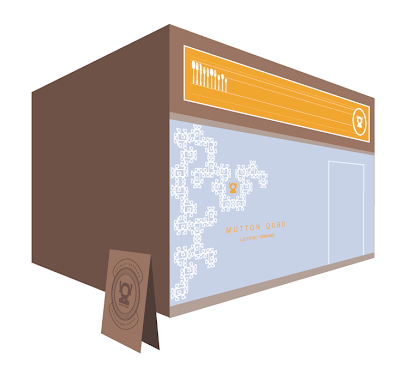
Exterior pattern used as a header for the restaurant, underneath would be a full glass front with ever so slightly dimmed lights showing the interior.
Exterior design would be used on a standing board outside the restaurant with a blackboard for the promotion of the restaurant and what it's offering.
Promotional leaflet, Front / White, Back / Orange.
The dimensions for these will be slightly bigger than a business card.
Order form - For the servers and waiters to take your order, I've chosen to use a wiro comb binding because it will rip a lot easier against a perforated length.
1. The grey design below is placed on your table through a small hole that acts as a holder for your table number, this will help staff when they come to take an order/ recognising tables.
2. Receipt.
Menu design.
Toilet signage... For the male and female signage I wanted to incorporate the logo in some aspects, I added and subtracted certain aspects to create instant symbolisations. The male sign features the logo (minus the tails of the Q) and legs. When compared to the female sign you can see the difference between the 'hairstyles' and the 'legs'
Work team - On floor staff / Polo / Casual/ Smart...
Web proposal
The design below would be used as the homepage of the restaurant, it will be operating using links and a click box that contains photographs representing the type of quality it serves.
I've chosen to use the bright orange colour featured on the header of the restaurant and promotional leaflets..the white text and cream patterns/emblems also follow in the features of the branding.
---------------------------------------------------------------------------------------
...For the inside pages of the menu I wanted to incorporate the theme of type abit more explicitly, using the Caps height, X-height and baseline as a container for the themes of the menu; Starters, Mains and Desserts.
I also chose various characteristics of type to use as headers for the categories of the menu.
Anatomy of type (characteristics)
Starters - Stem Ear Counter Axis
Mains - Terminal Hairline Shoulder
Desserts - Descender Shoulder Stem Stroke
( In the example below, the 4 characteristics reveal the word STARTERS.)


No comments:
Post a Comment