As well as concentrating on larger briefs, I also wanted to include various briefs that I could complete in short periods of time, this would maximise my chances of response and hopefully give me a larger chance of winning one of them. I came across 'Design Crowd' which was a website that allows its users to browse projects and submit designs for monetary gain. After browsing various projects I came across the following 'Logo design' project, it stood out amongst the other briefs because the company wasn't a start-up, it had a standing reputation and had been in business for 5 years prior.
Instead of approaching this brief using the obvious answers such as 'lightening bolts', 'clouds', 'sun' etc, I tried to approach it in a more contemporary manner and take advantage of the fact that it was an interactive weather service, using modern graphics to permeate the interactive and current aspects of their service...


As you can see from the creative requirements, the company wanted something modern, Professional and more serious than playful...
Type decisions

I really wanted to produce something original that wouldn't just consist of dynamic text and colour, I needed an idea that would promote the nature of ZoomRadar. Through research and investigation I ended up relating the theme of zoom, destinations and maps all into one concept...

Current webpage for company...

As you can see from the screenshot above, the website employs predominately blue's which I know from research and first hand experience that it means the colour of the sky, ocean, sleep, twilight. With this in mind along with the actual service ZoomRadars offering, its apparent that they also knew about this. So would it be possible to emulate the concept of weather through the colours alone?
Pinpoint development - As a solid shape, the pinpoint held too much emphasis and would take far too much of the attention away from the actual communication of my design so I needed to almost soften its appearance. I've done this by adding an inner circle which also opened up my design possibilities and breadth of ideas. I could incorporate the weather aspect or think of something more unique...


Obvious responses...
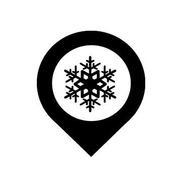


I thought about combining both weather and the idea of looking, as you can see I've developed an eye that holds the shape of the moon, although I thought the concept was quite unique, I thought it would've been difficult for viewers to instantly recognise what ZoomRadar was about, and without knowing the centre was a moon...would you of known?.


Final Logo's...


Incorporating colour...


As the deadline was near approaching, I thought it would of been a good idea to submit the initial logo as it was below. Submitting it with the current colour scheme of the company meant that the judges would be able to visualise the logo on their website. If there were further changes, I could submit more.


No comments:
Post a Comment