As a self initiated brief I was approached to design a set of branding for a Holistic Therapist in response to a monetary reward. I was able to set up numerous discussions and kept the client informed on my progress. She wanted the colours to be calming, smooth and bare resemblance to the colours of her towels and interior.


In my own personal opinion, I thought the colours would be the big decider in this branding, after an investigation into competition and similar services, I'd noticed that a lot of the colours being used were very energetic and in your face, when in fact you wanted to calm and soothe the audience, after all that was what her business was communicating.


Following on from my design ideas and investigation, I decided to use symbols that were representative of Holistic Therapy, but combine aspects together to create a concept behind my logo. As it stands the logo will be suggestive of: Restoring your balance.

As a starting point I was quite happy with the shape but knew it needed alot of developing before it turned into something I was completely happy with. The shape didn't really represent a business at this stage, instead it was just a silhouette.

Over the following screenshots you can see how I've tried to incorporate the idea of bodily rhythms and incorporate a sense of calmness...


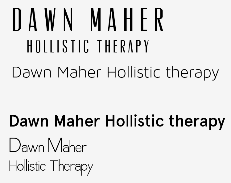
I thought using a Sans Serif font would of worked better because they often looked sleeker and more contemporary. But after visualising the different types in context, it turned out, Garamond...A serif typeface made the logo look more personal than any of the Sans serif fonts could've.
Primary Photography - taken for the purpose of advertising the Therapists services, I had the option to incorporate these photographs wherever I saw fit.


Because the therapist was offering a service around a local area, I thought a good way of getting her business known was to appeal to the local community through Facebook. Setting up a 'Business' Facebook page (which should be up-kept by the therapist), gives her the chance to promote deals and show an audience what services she's offering.


The client was very pleased with her branding and the only fault that she recognised was one of her own. She's asked me to remove the following photograph from her branding because it shows an excessive amount of oil on her hands.


Alternative design...If the client wasn't happy with the original business card, I'd prepared a slightly different approach.

As you can see I've incorporated the photographs into the 'promotional leaflet' which will display an over view of the business, whereas the actual leaflet includes information in a lot more depth.


No comments:
Post a Comment